
EconDoctor study guide
IB Economics diagrams: labels, shifts and explanations
A useful diagram makes an economic mechanism visible. Start with the event, choose the model that explains it, and show how the relevant variables change.
Choose the model and label its variables
Decide what the diagram needs to explain before drawing it. A market demand-and-supply diagram shows the price and quantity of a particular good or service. An aggregate demand-and-supply diagram shows the general price level and real output of an economy. The axes and the reasoning must match the model.
Give the diagram a title that identifies the market or economy. Label both axes with the economic variables, name the curves, and distinguish the initial situation from any change. If the source provides relevant units or numerical values, use them consistently. A schematic diagram can use symbols such as P₁ and Q₁ without inventing data.
Movement along a curve or a shift?
A change in the good’s own price causes a movement along its demand curve, other things equal. The quantity demanded changes. A change in a non-price determinant, such as preferences or the price of a substitute, can shift the demand curve: consumers now want to buy a different quantity at each given price.
The same distinction applies to supply. A change in the good’s own price leads to a movement along the supply curve. A change in production costs or technology can shift supply. Identify the initial cause, then follow its consequences through the model.
An increase in demand can raise the equilibrium price and cause an increase in quantity supplied along an unchanged supply curve. This price response does not itself shift supply.
Worked example: an increase in demand
Suppose a change in preferences makes a product more popular. At each price, consumers are willing and able to buy more, so demand shifts right from D₁ to D₂. Keep supply unchanged to isolate this effect.
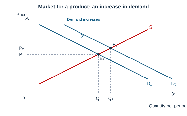
At the original price P₁, the increase in demand creates excess demand. The price tends to rise as buyers compete for the available output. As price rises, quantity supplied increases and quantity demanded along D₂ decreases until the new equilibrium E₂ is reached. The new price P₂ and quantity Q₂ are both above their original levels.
Connect the diagram to your explanation
Use the labels in your prose. Explain what caused D₁ to shift to D₂, why the original price would no longer clear the market, and how the movement towards E₂ changes the outcome. This makes the diagram part of the argument.
Keep the conclusion within the model’s assumptions. The diagram above isolates a demand change with an upward-sloping supply curve. If supply also changes, identify that second cause separately. The size of the price and quantity changes depends on the responsiveness of buyers and sellers.
Check your diagram
- Does the title identify the relevant market or economy?
- Do the axes show the correct economic variables?
- Have you changed the curve affected by the event, in the appropriate direction?
- Do the equilibria, projection lines and labels agree with your explanation?
- Have you explained the mechanism and any relevant assumptions?
For further reading on the underlying model, see OpenStax: shifts in demand and supply. To practise with case evidence, continue with using real-world examples in IB Economics.